It’s the middle of the month, which means it’s my turn to reveal for ScrapStuffz Inspired By!
Here’s the Inspiration Photo:

February SSIB Inspiration Photo
I hemmed and hawed for a long time over what to do. I’m really not a pink girl, so I wasn’t all that inspired by the colours. I’m not frilly, either. And I really really (not just really) don’t do Valentine’s…. so this just wasn’t speaking to me for ages! Then, my sister’s birthday rolled around. She wanted to go to the Ice Castle up at Midway. And BOOM. Inspiration. The ice castle is built in tiers, just like this display! So, that was my inspiration, the tiered shape of the display.
Plus…. I was so excited when the CSI Scrap365-4 Case File was revealed, because the colours were just soooooo perfect for my Ice Castle photos.

Case File S365-4
Awesome stuff, huh?
So, without further ado…. My LO!

SSIB February DT, CSI Case File S365-4
I’m so in love with this. Seriously, the results are just perfect. I only wish I could get a photo that really does it justice. There’s just no way. But I can give you a couple close ups to help you see!

This one gives you a closeup on pretty much everything going on.
- Background Work – I used a Heidi Swap 6×6 mask and an embossing ink stamp pad. I taped the mask down, then stamped through it. Pulled up the mask, sprinkled some Zing Gold Embossing Powder on a couple spots, tapped it off. Added Zing Brown Sugar Embossing Powder, tapped it off. (Made sure the whole pattern was covered by one or both colours.) Then I heated the powder to set it. Repeat til I had the background big enough. I had to wash my stencil every time I picked it up so that I wouldn’t get bleed through from previous uses.
- The Title – My awesome friend Barbara suggested I do an Ombre Coloured Title. Which was AWESOME but turned out to be WAY easier said than done. Steep learning curve! Here are my first few attempts….

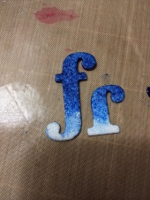
As you can see, the second attempts were significantly more successful than the first. But still, it was tough! What ended up working best was to have a puddle of water on my Kraft Mat (seriously, I could not live without that thing!), slightly wet the whole letter, then tap it dry with a paper towel in a reverse obmre direction (so very dry at the tip, less dry up higher). There really only was a tiny amount of water on the letter, but it let the ink spread easily. I would then tap off some of the ink, then reapply water, tap dry, ink, tap off….. until I got the right look. Once I got the system down, it really wasn’t too bad. Even went pretty fast. And then I did my favourite thing…. picked up the whole thing (mat and letters) and stuck it in the oven on warm!
- Drippy Icicles – These were probably my favourite bit. I had to figure out how to do them so that I could control where the drips fell. What I eventually came up with was condiment squeeze bottle. It was great for this project, because I wanted thick lines, but if you wanted to do something finer, I’d suggest something like a plastic bag and a icing tip. What I did, though, was grabbed my Golden Gel Medium “Clear Tar Gel”, which is pretty thin, but still has some body to it. I then used a couple drops of ink (Mr Huey’s Powder Blue) to tint the gel. Then I loaded it into my squeezy bottle, and squeezed out a line of gel under each title word (which I had adhered to my Kraft Mat). Then I shook the mat to get the gel to drip down. I wanted it to be as organic as possible to really mimic the formation of real icicles. Once I got them long enough, I stuck the whole thing in the oven. Usually I try for a heat that won’t boil the medium, but this time I WANTED the bubbles, so I set it at 170* F and closed the oven door. Perfect. Once it was completely dry, they peeled off the mat like a DREAM! Seriously, this was perfect. I added the jewels as water droplets to give the impression that the icicles were still forming.
Here are a couple additional close ups:


As you can tell, I love this LO. Hope you can get some inspiration and join us over on SSIB. Don’t forget to share your LO with us (there’s a link in the blog’s sidebar), and especially don’t forget to let us know what you were Inspired By!

Love, love, love what you did with the background and letters. So wish I could see this place in real life.
Clever lady… I love this layout… Lots of work but the end result is totally worth it… Looks amazing…. 🙂
It came out fantastic (and thanks for the shout out;) )
You deserved it, Barbara!
Wow! An awesome layout…..love the beautiful blue and the amazing texture! Thanks for the neat tutorials!
[…] may remember a few weeks ago when I posted my Ice Castle LO, and I talked about using a stencil and embossing ink/powder to create the background? I used […]